my little project..
Nov 10, 2010 | 07:52 AM
Thread Starter
Joined: Jul 2010
Posts: 222
Likes: 0
From: new mexico
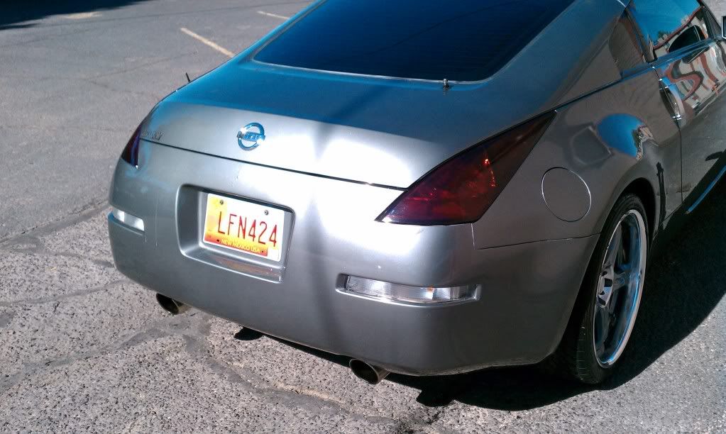
Yeah I think the emblems throw each other off... I ll take some after carwash pics
Nov 10, 2010 | 10:37 AM
Thread Starter
Joined: Jul 2010
Posts: 222
Likes: 0
From: new mexico
Nov 10, 2010 | 10:41 AM
Joined: Jan 2006
Posts: 2,190
Likes: 0
From: Ohio
I like it. I would leave the "Z" off also. I think if you made them a bit smaller, more people would like them.
Nov 10, 2010 | 10:56 AM
Thread Starter
Joined: Jul 2010
Posts: 222
Likes: 0
From: new mexico
yeah, im on the fence about the Z now though
Nov 10, 2010 | 11:03 AM
Joined: Aug 2007
Posts: 1,142
Likes: 1
From: CA
I'm afraid you're going into the realm of Rice. The criticism i have is that it looks so handmade that it looks weird. The numbers are flat. Yes i agree stickers would've been better.
Nov 10, 2010 | 11:20 AM
Thread Starter
Joined: Jul 2010
Posts: 222
Likes: 0
From: new mexico
thanks...
Nov 10, 2010 | 07:14 PM
Joined: Dec 2000
Posts: 1,337,017,813
Likes: 78
From: Dallas / Chicago
Quote:
Originally Posted by
3hree5ive0ero
I like the idea, but those numbers are way too big and look out of place on a car without other CF accents, imho.
^I stand by what I said earlier. Smaller would look I better, too, I think.
Maybe you could make CF Nissan burgers?
BTW, those look so much better in your second set of pics than it did in your first.
__________________
Nov 10, 2010 | 07:56 PM
Joined: Jun 2003
Posts: 7,179
Likes: 27
From: MPLS/ST.Paul MN
Quote:
Originally Posted by
ksmoore
thanks...
if you went with a tighter weave it would look better... not good, but better
Nov 11, 2010 | 06:32 AM
Thread Starter
Joined: Jul 2010
Posts: 222
Likes: 0
From: new mexico
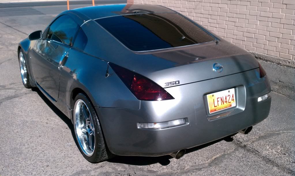
yeah the second attempt is way better then the first especially when put side by side. i thought about a nissan burger attempt, i just dont know if i should or not...
Nov 11, 2010 | 05:02 PM
Joined: Aug 2008
Posts: 451
Likes: 0
From: queens NY
the original emblems look better! but good effort nonetheless
Nov 11, 2010 | 05:07 PM
Joined: Jan 2009
Posts: 8,235
Likes: 5
From: 15 mins from white house
Nov 11, 2010 | 05:12 PM
Thread Starter
Joined: Jul 2010
Posts: 222
Likes: 0
From: new mexico
Nov 12, 2010 | 08:47 AM
Joined: May 2007
Posts: 1,700
Likes: 0
From: S.A. TX/SO-CAL
These dont go with the car at all, just looks out of place. This would look better to decorate an the engine bay if anything, but its your car do as you please
Nov 12, 2010 | 11:00 AM
Joined: Jul 2009
Posts: 5,217
Likes: 18
From: Maryland & Arkansas
2nd attempt, looks way better.
Nov 13, 2010 | 06:58 PM
Joined: Aug 2008
Posts: 1,316
Likes: 3
From: NYC
Nov 13, 2010 | 07:36 PM
Thread Starter
Joined: Jul 2010
Posts: 222
Likes: 0
From: new mexico
thanks for the input fellas, agreed second attempt looks way better.... its still on the car atm, more then likely will stay....
Nov 13, 2010 | 09:45 PM
Joined: Apr 2008
Posts: 9,201
Likes: 73
From: Miami
still looks odd... maybe b/c its flat.
Nov 15, 2010 | 12:41 PM
Joined: Oct 2009
Posts: 9,714
Likes: 3
From: North Jersey
don't think it'll work on the other Z colors but it looks good on yours. props for being unique.
Nov 16, 2010 | 07:43 PM
Thread Starter
Joined: Jul 2010
Posts: 222
Likes: 0
From: new mexico
yeah its not dimensional... but ut sure is different
Nov 16, 2010 | 10:05 PM
Joined: Dec 2003
Posts: 3,271
Likes: 1
From: St Louis
Props for your project, but the result looks really tacky to me.


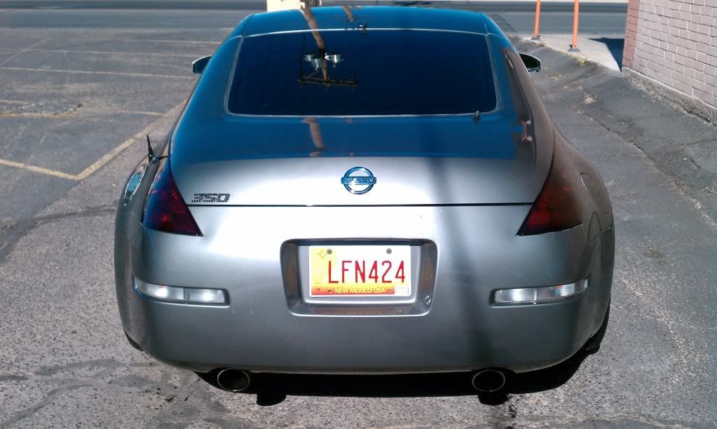


 BTW, those look so much better in your second set of pics than it did in your first.


