
Monitor Color Calibration (Huey Pantone Pro)


Thread Starter
Registered User
iTrader: (9)
Joined: Dec 2003
Posts: 2,069
Likes: 1
From: Waipahu HI; Phoenix AZ
One aspect of digital photography that is often overlooked is monitor calibration. Calibration is important because colors that you are seeing on your monitor (and your photos), might be seen differently by other users (can't be helped if the other person's monitor is not calibrated). Color accuracy should be addressed sooner, rather than later, as it will save you from redundant reprocessing.
I saw this problem first hand at my desktop, seeing different colors from the same photo from monitor to monitor. In my case, I use dual (extended) screens with an iMac and Gateway monitor. The Gateway was warm compared to the iMac. Using Mac OS X adjustable color profiles was tricky, so I opted to use a Pantone Huey to calibrate both monitors with recommendation from Leemik.
Viewing my old processed shots with the calibrated settings showed what was once vibrant colors, became bleached out or muddy, and white balance inaccurate. It took awhile, but i reprocessed my shots.
Here's a review of the Pantone Huey:
http://www.photographyblog.com/reviews_huey_pro.php
And an overview of the product from at Pantone:
http://www.pantone.com/pages/product...x?pid=562&ca=2
Pantone has two variations: regular or Pro. Click Pantone link above to find out the differences.
There are other calibration devices like ColorVision Spyder and GretagMacbeth Eye-One.

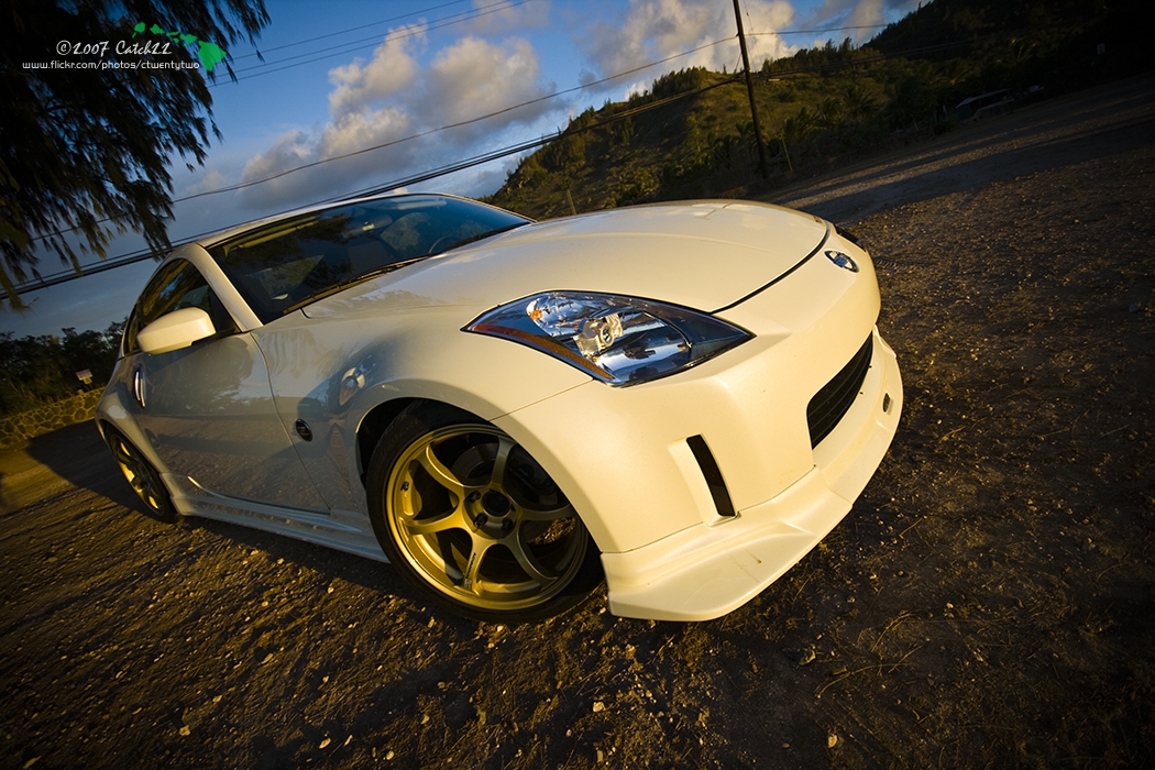
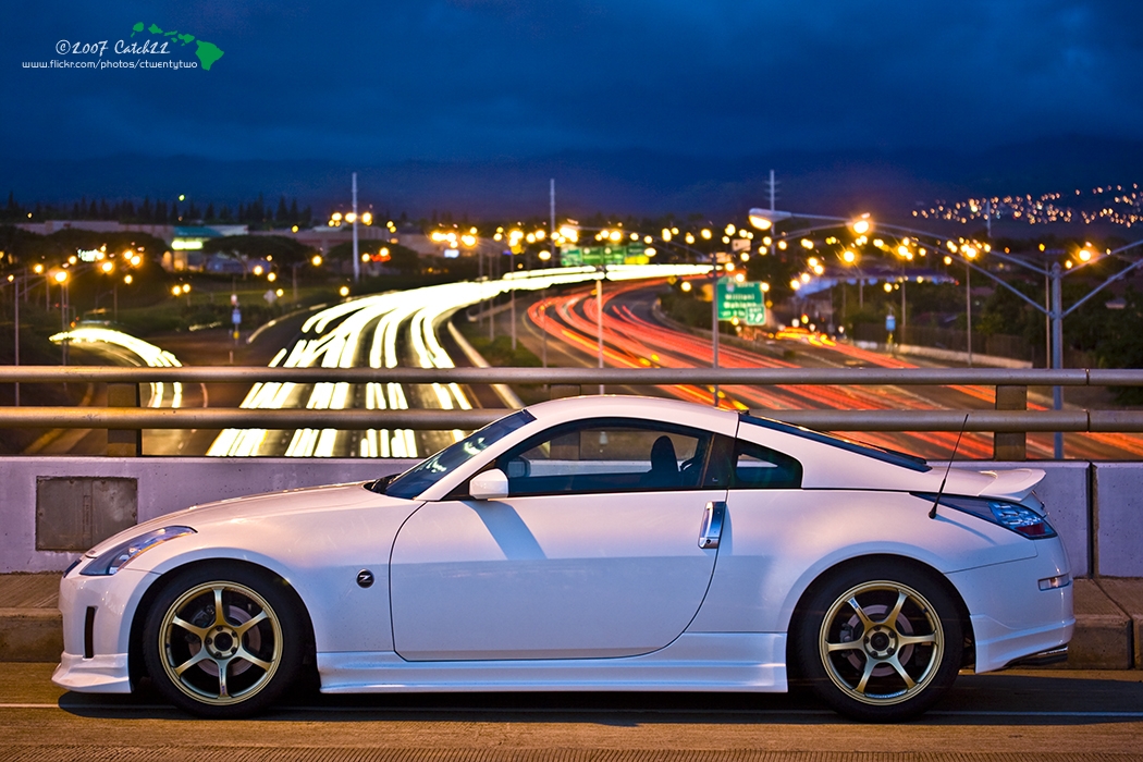
Some old images that was processed with a calibrated monitor:


I saw this problem first hand at my desktop, seeing different colors from the same photo from monitor to monitor. In my case, I use dual (extended) screens with an iMac and Gateway monitor. The Gateway was warm compared to the iMac. Using Mac OS X adjustable color profiles was tricky, so I opted to use a Pantone Huey to calibrate both monitors with recommendation from Leemik.
Viewing my old processed shots with the calibrated settings showed what was once vibrant colors, became bleached out or muddy, and white balance inaccurate. It took awhile, but i reprocessed my shots.
Here's a review of the Pantone Huey:
http://www.photographyblog.com/reviews_huey_pro.php
And an overview of the product from at Pantone:
http://www.pantone.com/pages/product...x?pid=562&ca=2
Pantone has two variations: regular or Pro. Click Pantone link above to find out the differences.
There are other calibration devices like ColorVision Spyder and GretagMacbeth Eye-One.
Some old images that was processed with a calibrated monitor:
Last edited by ctwentytwo; Jan 3, 2008 at 01:41 AM.


I picked one of this up once I discovered that my monitor and printer where not matching. My printer was printing to bright on the reds and blues, but in my screen they would look fine. I use a Canon MP510 printer and a HP 21" monitor. Now everything comes out great.

Thread Starter
Registered User
iTrader: (9)
Joined: Dec 2003
Posts: 2,069
Likes: 1
From: Waipahu HI; Phoenix AZ
Originally Posted by rr_z33
nice. you comming out 2morrow night?
Originally Posted by MR_X
I picked one of this up once I discovered that my monitor and printer where not matching. My printer was printing to bright on the reds and blues, but in my screen they would look fine. I use a Canon MP510 printer and a HP 21" monitor. Now everything comes out great.
Originally Posted by erickim080387
WOW.... is all i can say by looking at your photos. im new to photography and wanna take shots like you do... want to teach me sometime?

Thread
Thread Starter
Forum
Replies
Last Post
350Z Project X
Suspension
9
Oct 10, 2015 09:23 AM

