NorCal 350Z Logo Ideas... please add on...
 04-27-2004, 09:57 PM
#101
350Z-holic

iTrader: (2)

Join Date: Jun 2001
Location: teh interwebnets
Posts: 17,685
Likes: 0
Received 0 Likes
on
0 Posts
Originally posted by fowlman01
I think you can do your design with just two colors unless I am missing something. Red and black on a white shirt. the various shades of gray/silver can be produced by changing screen values with the black.
I think you can do your design with just two colors unless I am missing something. Red and black on a white shirt. the various shades of gray/silver can be produced by changing screen values with the black.
I sure hope that works... and I agree with *****. Black shirts would be pretty darn catchy provided that costs don't inflate too heavily by requesting such.
And sweatshirts, hoodies like Henry suggested... why not? The only thing is that we should probably commit to at least 20 if we do go with articles other than t-shirts. I don't foresee the t-shirt demands falling below 30 (with our BA group being enthusiastic as it is)... I know that I'd pickup three or so for my self at an average cost of $15/shirt.

 04-27-2004, 10:14 PM
#103
350Z-holic
iTrader: (2)
Join Date: Jun 2001
Location: teh interwebnets
Posts: 17,685
Likes: 0
Received 0 Likes
on
0 Posts
I changed the image's border to be more visibly gray/silver around the black circle. For information's sake, the image was designed at about 5.6"x5.6" at 300 DPI... not in vector format.
04-28-2004, 05:51 AM
#104
If it is to go on a black shirt it then becomes necessary to use three colors (white, black and red) Possibly could get by with two (white and red) I still don't think it is a big deal, since the design is pretty simple to register. (no tiny detail or traps). It will look best on a black shirt.
04-28-2004, 11:14 AM
#106
Registered User
Join Date: Sep 2002
Location: SF Bay area
Posts: 227
Likes: 0
Received 0 Likes
on
0 Posts
What if the GGB was behind the Z logo?
Make the GGB slightly larger in the background.
My eye firsts sees the "Z" with a red blur in the front.
The Z is the dominante image, and it looks like the bridge is floating in front of it.
If the Bridge was also slightly transparent, or faded into the black background, it would look a little cleaner, and less busy.
Other than that little tidbit, I likes it.
04-28-2004, 11:28 AM
#107
350Z-holic
iTrader: (2)
Join Date: Jun 2001
Location: teh interwebnets
Posts: 17,685
Likes: 0
Received 0 Likes
on
0 Posts
Originally posted by Sybertron
What if the GGB was behind the Z logo?
Make the GGB slightly larger in the background.
My eye firsts sees the "Z" with a red blur in the front.
The Z is the dominante image, and it looks like the bridge is floating in front of it.
If the Bridge was also slightly transparent, or faded into the black background, it would look a little cleaner, and less busy.
Other than that little tidbit, I likes it.
I'll put your suggestions together when I get home so you can see how it looks.
04-28-2004, 09:06 PM
#108
Registered User
iTrader: (2)

Join Date: Feb 2004
Location: NOR*CAL
Posts: 1,407
Likes: 0
Received 0 Likes
on
0 Posts
The idea is great. Something isn't exactly right though... hmmm, maybe a bigger bridge behind the Z logo. I just can't put my finger on it. Maybe smaller and on top of the Z... just don't know
04-28-2004, 09:22 PM
#109
Registered User
iTrader: (10)

Join Date: May 2003
Location: SF Bay Area
Posts: 3,282
Likes: 0
Received 0 Likes
on
0 Posts
Originally posted by Z-INCOGNITO
here's a sample of what it would look like...
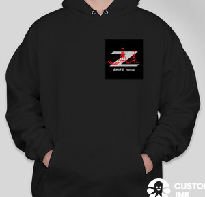

here's a sample of what it would look like...
that looks ok. but i wouldn't want 2 of the same images on both the front and back. i say only the front or the back. unless we can use a different image for the front and use brian's design for the back. but then again 2 diffent images would probably cost more.
and i'm still waiting on my friend to get the info on the shirt prices.
04-28-2004, 11:07 PM
#110
350Z-holic
iTrader: (2)
Join Date: Jun 2001
Location: teh interwebnets
Posts: 17,685
Likes: 0
Received 0 Likes
on
0 Posts
Originally posted by LouZer
The idea is great. Something isn't exactly right though... hmmm, maybe a bigger bridge behind the Z logo. I just can't put my finger on it. Maybe smaller and on top of the Z... just don't know
The idea is great. Something isn't exactly right though... hmmm, maybe a bigger bridge behind the Z logo. I just can't put my finger on it. Maybe smaller and on top of the Z... just don't know
Sybertron, I'm not quite diggin' it, but here is what I think you're trying to tell me...
04-29-2004, 05:51 AM
#111
Originally posted by yobri
I actually like how it is for the fact that the Z emblem (on the sides of the car) is retained in the design with a dash of the GGB in the mix. The Z is unmistakeable so, the GGB isn't obstructing the view, per se... IMO. Provide a suggestion and I'll put it to work though.
Sybertron, I'm not quite diggin' it, but here is what I think you're trying to tell me...
04-29-2004, 06:57 AM
#112
350Z-holic
iTrader: (2)
Join Date: Jun 2001
Location: teh interwebnets
Posts: 17,685
Likes: 0
Received 0 Likes
on
0 Posts
Originally posted by fowlman01
Looks like a mistake that way. The bridge is "light" compared to the Z, so generally the bridge would go over the Z.
Looks like a mistake that way. The bridge is "light" compared to the Z, so generally the bridge would go over the Z.
04-29-2004, 07:11 AM
#113
Originally posted by yobri
Hey Walt, so are you suggesting to stay with the original as it is, or the original with the bridge lighter?
Hey Walt, so are you suggesting to stay with the original as it is, or the original with the bridge lighter?
Feel free to call me if you want more input. I can even check with the Napa ROP program at Vintage High to see if they would print the shirts for us. I think we could get them done fairly inexpensive if they would do them. I would check their quality of course.
04-29-2004, 09:56 AM
#115
Registered User
Join Date: Sep 2002
Location: SF Bay area
Posts: 227
Likes: 0
Received 0 Likes
on
0 Posts
Originally posted by yobri
I actually like how it is for the fact that the Z emblem (on the sides of the car) is retained in the design with a dash of the GGB in the mix. The Z is unmistakeable so, the GGB isn't obstructing the view, per se... IMO. Provide a suggestion and I'll put it to work though.
Sybertron, I'm not quite diggin' it, but here is what I think you're trying to tell me...
I agree with what you siad... thanks for spending time on it.
I actually like your original, but without the Bridge.
I know the bridge is a symbol of the Bay Area... but maybe simple is better in this case?
On the other hand... the Color of the bridge does make it stand out more.
I'm totally confused now...
 04-29-2004, 10:10 AM
#116
New Member
Thread Starter
iTrader: (9)

Join Date: Sep 2003
Location: Go A's
Posts: 3,653
Likes: 0
Received 0 Likes
on
0 Posts
Originally posted by zwindsor
I like it Yobri Definately on a black shirt, front. polo style
I like it Yobri
Definately on a black shirt, front. polo style
I used to work for Eddie Bauer and they have great polo pique shirts... i'll see if i still know anyone there and maybe get some discounts on those shirts...
Last edited by Z-INCOGNITO; 04-29-2004 at 10:12 AM.
04-30-2004, 06:34 AM
#119
Registered User
iTrader: (1)
Join Date: Jun 2002
Location: San Jose
Posts: 508
Likes: 0
Received 0 Likes
on
0 Posts
I finally decided to check the thread out and you guys have a lot of great ideas.
I think the best way to show our nor cal pride is to make stickers and put them on the 1/4 window of our cars..
That way its simple and cheap and it doesn't cost a whole lot of money.
T-shirts are cool too but I would be willing to help out with the stickers part.
We could even collect a dollar or two from everyone at the mini pocket bike meet. But I definetly think we should talk about it there too
Whacha think and we can do a finally poll vote for final logo design. Hows that sound?
zya
Yuichi
I think the best way to show our nor cal pride is to make stickers and put them on the 1/4 window of our cars..
That way its simple and cheap and it doesn't cost a whole lot of money.
T-shirts are cool too but I would be willing to help out with the stickers part.
We could even collect a dollar or two from everyone at the mini pocket bike meet. But I definetly think we should talk about it there too
Whacha think and we can do a finally poll vote for final logo design. Hows that sound
?zya
Yuichi
04-30-2004, 07:11 AM
#120
350Z-holic
iTrader: (2)
Join Date: Jun 2001
Location: teh interwebnets
Posts: 17,685
Likes: 0
Received 0 Likes
on
0 Posts
Originally posted by Yuichi
I think the best way to show our nor cal pride is to make stickers and put them on the 1/4 window of our cars..
I think the best way to show our nor cal pride is to make stickers and put them on the 1/4 window of our cars..
You got a lead into a person (friend) that prints decals Yuichi?