
|| d e r a i l //


i don't want the cops to pull up and see decals in the rear... extra reason to pull over some ricers like us... haha. at least front has a chance to sneaking by.

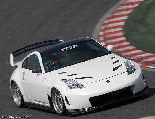
I posted this one cause this is tolerable size I'll put on my windshield.. nothing bigger.. smaller is just gay.. I prefer it here exactly the same
as for rear windshield.. I think a block there looks pretty tacky. It's better if its just one straight line (like decal #1).. but again, more cop attention..
as for rear windshield.. I think a block there looks pretty tacky. It's better if its just one straight line (like decal #1).. but again, more cop attention..
im down for a rear window decal but would prefer to keep the front windshield clean. im also willing to do the side but tony got stuff there already. but reason i would prefer the rear is cause i already have plans now for the derail sides. PLUS for photo shoot i think the rears would look best... anyone agree??


It's not going to work out with #1 on the front unless you want it alllll the way across. #1 is just too stretched to be putting it in the center like the amuse. #2 in front is perfect in replacement to the amuse.
how about this... as long as we all have a derail decal in the same spot we can all pick the one that best fits our own car... im in agreement with tony. i like #2 personally. and i also agree with boba... the #1 would need to be stretched across or it just wont look appealing but hey, im a ricer so dont take my word on it hahahaa
but boba has a point on #1 over stretching... if its just a thin small sticker like last time's and we put it smack middle of front, not sure if it'll look nice.. maybe we can shift it to one side in the front? that or have it hugeeee to go across (too big for my taste)
I like #2 in the front.. direct swap from the amuse one..
I like #2 in the front.. direct swap from the amuse one..
how about this... as long as we all have a derail decal in the same spot we can all pick the one that best fits our own car... im in agreement with tony. i like #2 personally. and i also agree with boba... the #2 would need to be stretched across or it just wont look appealing but hey, im a ricer so dont take my word on it hahahaa
DUDE! SAME DECAL SAME LOCATION MAN! stop running yours different!
i'm tired of this... we're letting boba and m6 derailing this?? arn't they the closet buddies with the rubber suit? hahahaha.
i'm going to sleep... got meeting in the morning... have at it and let's see what nel can come up with. he is into graphic design... i like to know what he says and i'll go with that.
i'm going to sleep... got meeting in the morning... have at it and let's see what nel can come up with. he is into graphic design... i like to know what he says and i'll go with that.

haha i edited it right before you posted that... we are all thinking the same thing but mikey is on a different bus... his bus is a tad bit shorter then ours
Lol I didnt read the previous posts but from a guy who is somewhat knowledgeable in graphics design as well, #2 would fit best in windshield. Nel can photoshop it up like the below post so it's more visual for us. But the final product is going to look diff with the glow effects and whatnot so the black text can contrast the windshield. Plus, sizes can change, nothing's set in stone.


Honestly, I think #1 should go on the sides because it is longer and not tall. It will fit nicely on the small windows.
#2 should go on the windshield because its narrow but tall, just like how it is on that Amuse Z.
#2 should go on the windshield because its narrow but tall, just like how it is on that Amuse Z.

