
Recommendations on our logo??


Hey everybody, I know most of you are awesome graphic designers (Anh lol!) and we as the National Z Club need a sweet logo. Lets post up our tries!

Registered User
Joined: Apr 2004
Posts: 114
Likes: 0
From: Washington DC
since we are sister clubs, If you guys feel like it, I suggest you guys take our logo and replace the G with the metal Z with the bolts in it like the My350z logo, that way we have some consistency.

and replace the G with the signature metal Z

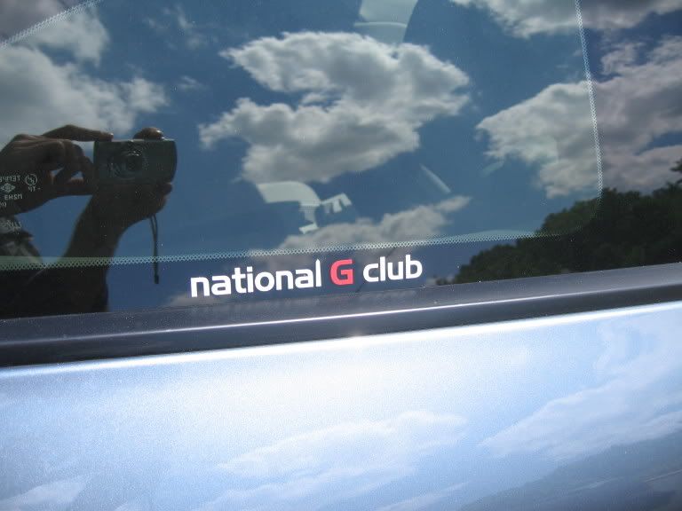
Our logo is sleek in that the Washington monument is hidden in the "l", in national, and its really clean and simple. Its a good idea to keep the logo simple because its much better looking when you turn it into a decal for the windows.
good luck with the process though, we support whatever you guys come up with!
and replace the G with the signature metal Z
Our logo is sleek in that the Washington monument is hidden in the "l", in national, and its really clean and simple. Its a good idea to keep the logo simple because its much better looking when you turn it into a decal for the windows.
good luck with the process though, we support whatever you guys come up with!

Originally Posted by yiaquemini
since we are sister clubs, If you guys feel like it, I suggest you guys take our logo and replace the G with the metal Z with the bolts in it like the My350z logo, that way we have some consistency.
and replace the G with the signature metal Z
Our logo is sleek in that the Washington monument is hidden in the "l", in national, and its really clean and simple. Its a good idea to keep the logo simple because its much better looking when you turn it into a decal for the windows.
good luck with the process though, we support whatever you guys come up with!
Sorry to put this in words, I dont really have the resources right now to mock up an image, maybe I will try to post my idea tomorrow when I get to work and have some time!

Trending Topics

Registered User
Joined: Apr 2007
Posts: 636
Likes: 0
From: commonwealth of no. virginia
Originally Posted by PumpedVA
I like the logo above but without a black back ground . I am thinking of just lettering.
Originally Posted by Sean
I don't like the name. Don't get me wrong, I am glad you are keeping the Canadians out, but there are some good Aussies out there.
Maybe International Z Club?
Maybe International Z Club?

Registered User
Joined: Jan 2006
Posts: 8,719
Likes: 2
From: nj
Originally Posted by MrKaira
Its actually National, like around Washington D.C. type national, not national for the entire nation, since Washington D.C. is the national capital, thats why its the National Z Club but not really national like the entire nation.
Call it
Capital Z Club
or maybe Murder Capital Z Club

Registered User
Joined: Jun 2004
Posts: 23
Likes: 0
From: Washington, D.C.
Originally Posted by MrKaira
Its actually National, like around Washington D.C. type national, not national for the entire nation, since Washington D.C. is the national capital, thats why its the National Z Club but not really national like the entire nation.


